Streamlining Crisis Communication in Pet Help & Rescue’s (PHaR) Messaging
Client
Animal Help Now
My Role
Lead UXD & Project Manager
Industry
Nonprofit & TECH4GOOD
Timeline & Status
2.5 weeks—Launched
TLDR;
Inspired by the Marshall Fires, I led the redesign of a mission-critical emergency messaging flow to support users in high-stress disaster scenarios. By stripping away feature bloat and prioritizing a "safety-first" hierarchy, I slashed the time-to-task from 83 seconds to under 7 seconds, a 92% reduction in critical response time. This project was a deep dive into designing for the "panicked user," proving that in high-cortisol environments, the interface must be invisible to ensure the user can focus entirely on life-saving outcomes.
CONTEXT
PHaR is Designed to Empower DURING a Crisis
PHaR is a community response platform for pet unpreparedness. While it supports long-term networking, its core is the Emergency Messaging System. In digital health terms, this is a safety-critical system where the interface must perform when the user is at their most vulnerable.

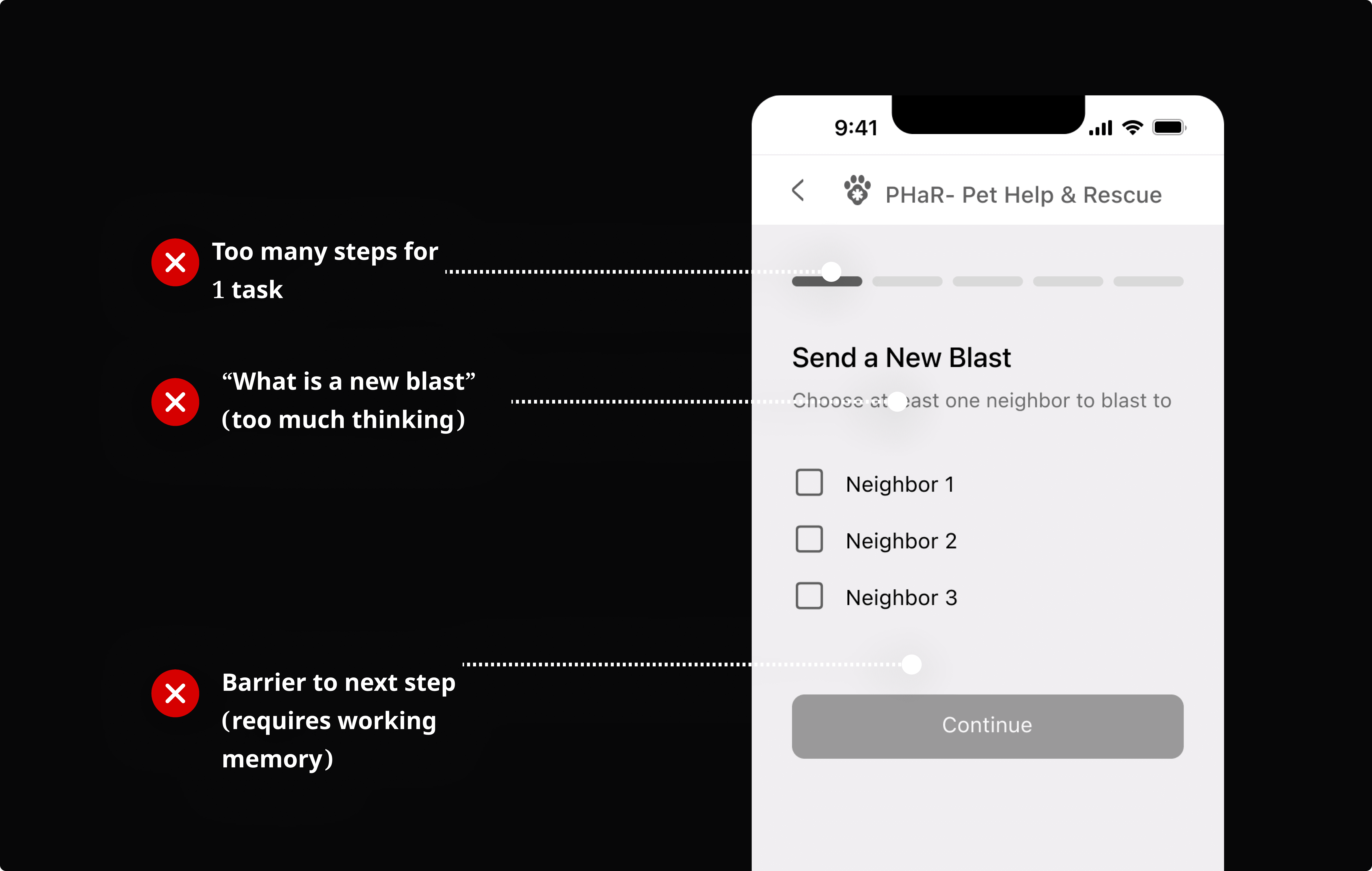
PROBLEM SPACE
Emergency Messaging Is Too Cognitively Taxing
Early heuristic auditing and internal testing with 5 prospective users, simulating pressure or stress through a 30-second time frame.


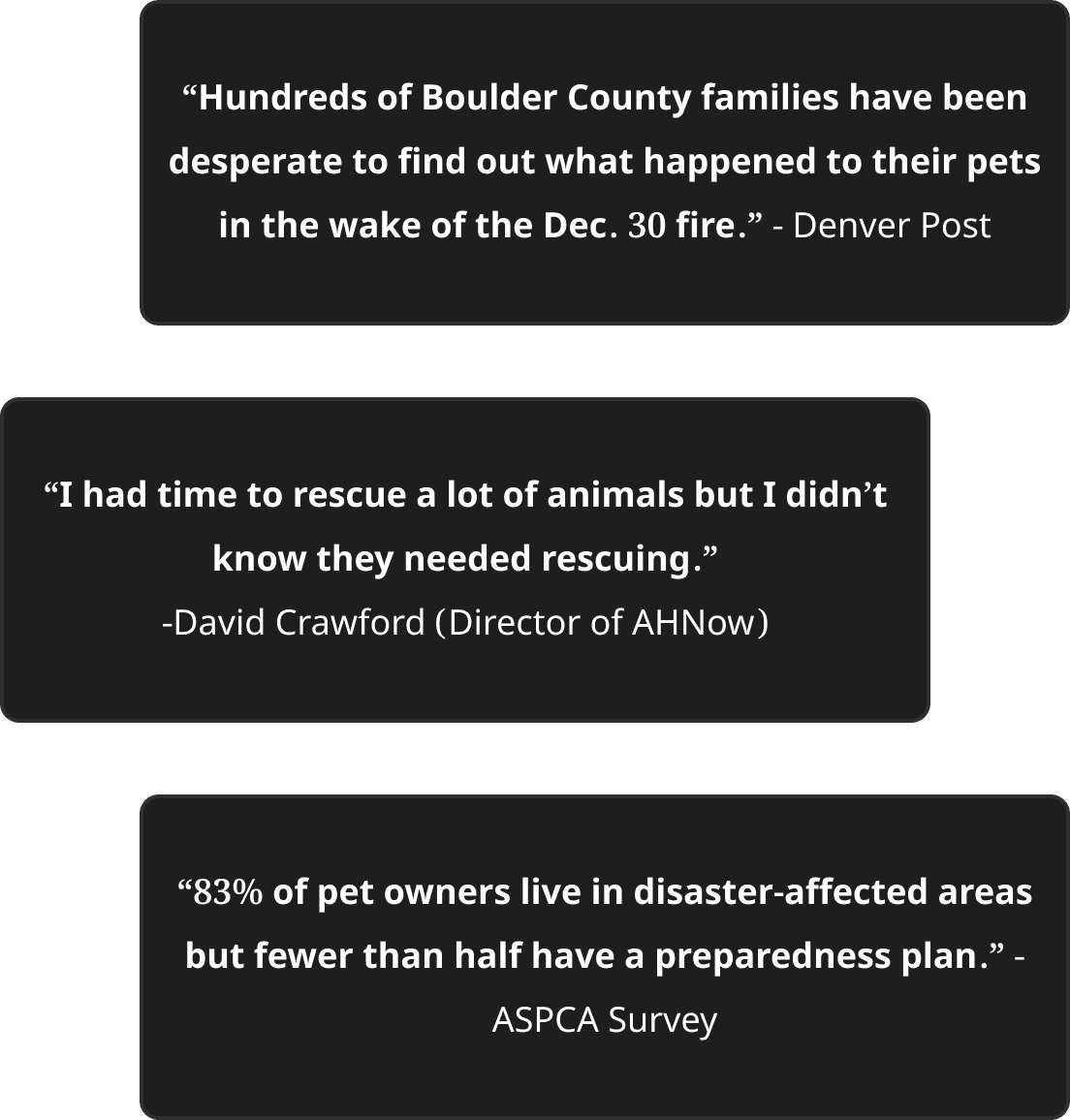
WHY IT MATTERS
Designing for Distress: Amy's Story

Amy is working her mundane office job
A neighborhood wildfire alert triggers fear and anxiety for her cat at home, Pumpkin.

Her executive function is reduced, she runs out to her car but traffic is blocked.

Amy is panicked, unable to figure out what to do. She just wants Pumpkin to be safe.
Failure Point: PHaR is Not Designed For Amy's Panic Mode
According to the CDC, emergency situations trigger physiological responses that impair:
1
Working Memory: Information is harder to recall, needed in multi-wizard layouts
2
Motor Skills: "Fumble-fingers" or shaking hands making micro-user interactions difficult
3
Information Processing: Increased misinterpretation of complex instructions.
DESIGN GOAL
Optimizing PHaR for "Panic Mode"
My aim was to reduce Time-on-Task (ToT) and Single Ease of Task. I.e., remove all "hard choices" and extra taps, ensuring the app remains usable even when a user is shaking, distracted, or overwhelmed.
IDEATION
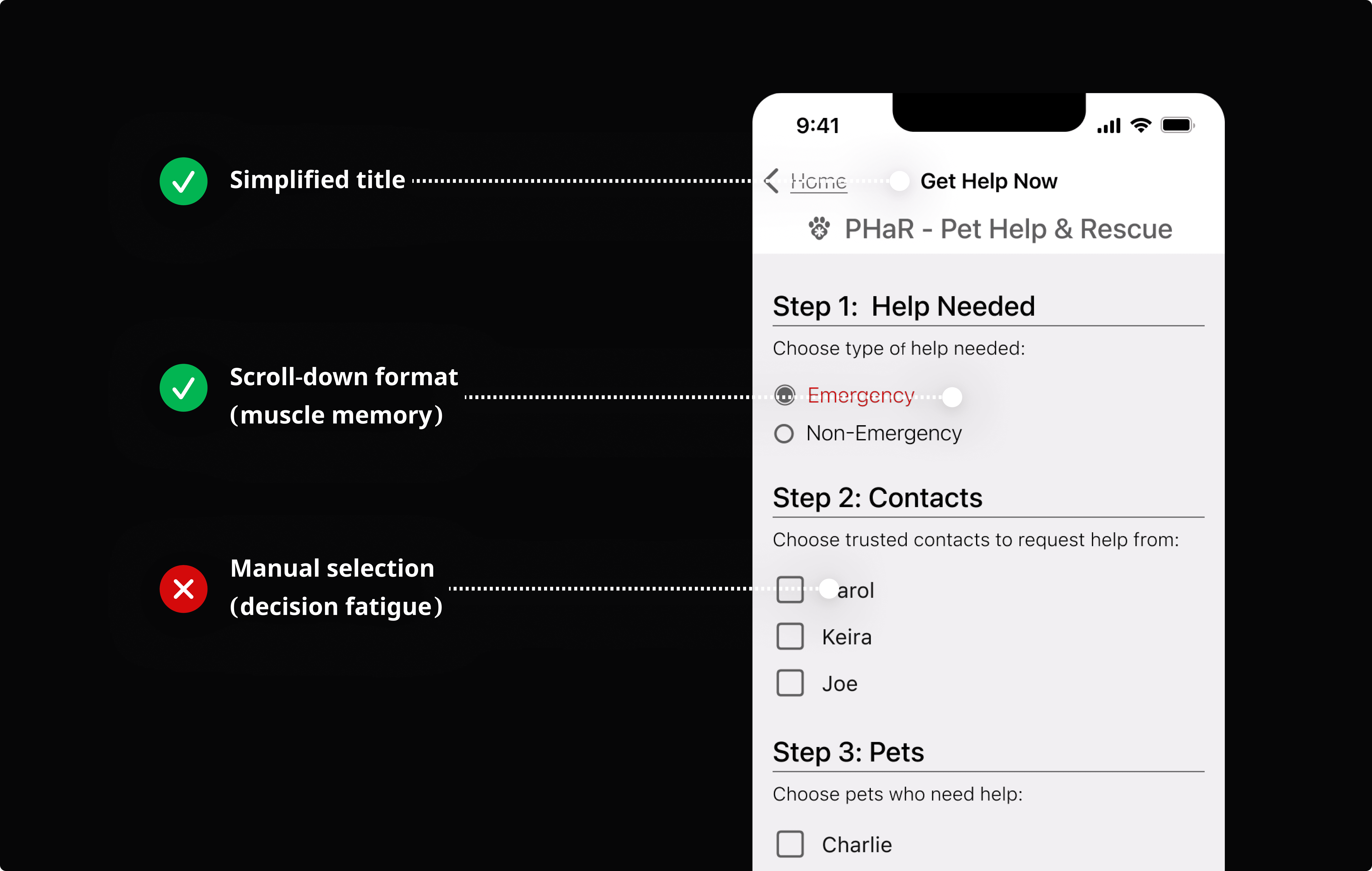
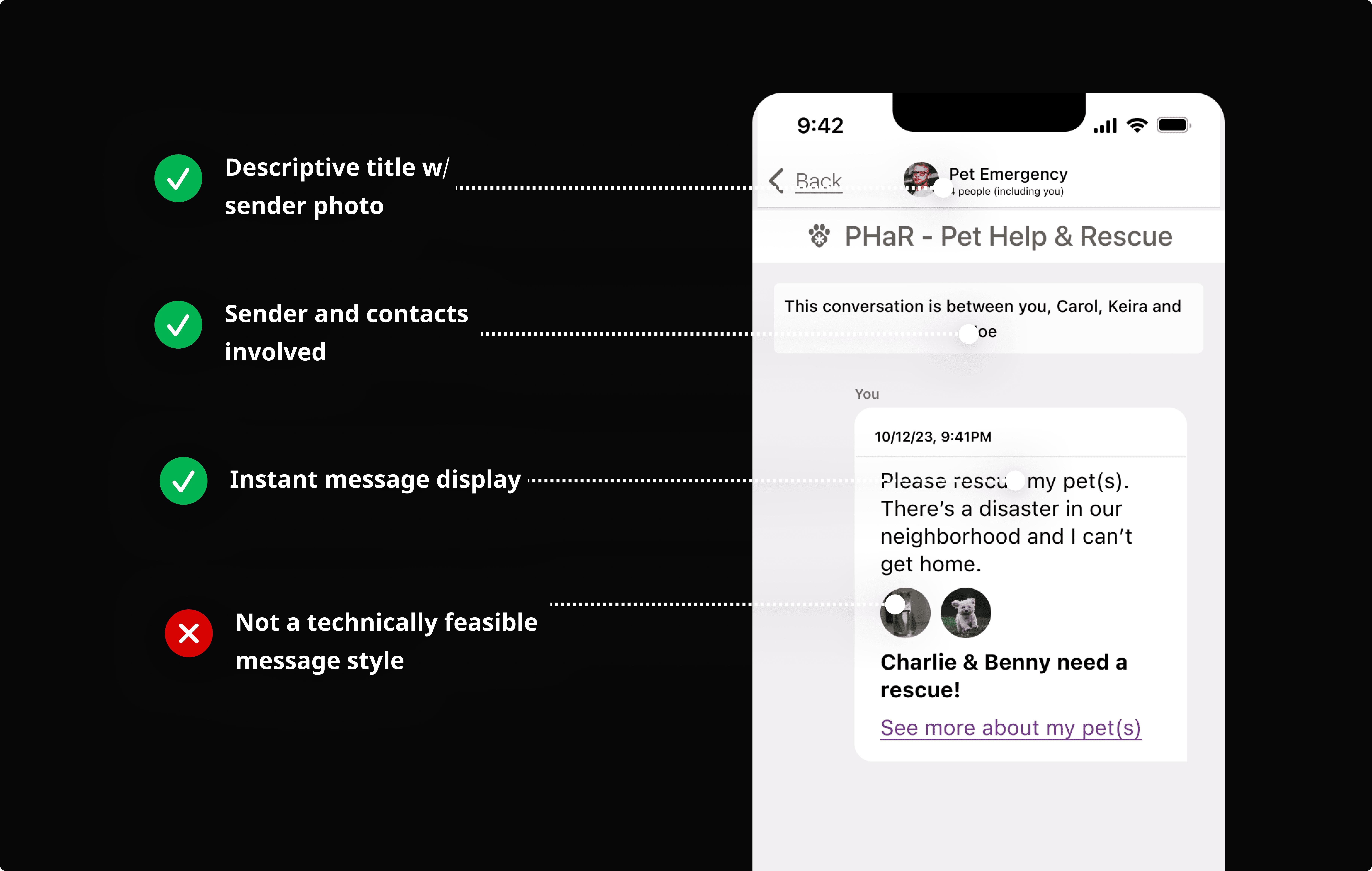
To Reduce Complexity, I Studied Messaging & Emergency Apps
To learn more about user patterns and UI that is created according to "muscle memory," I turned to existing solutions.
DEVELOP: IDEATION VALIDATION
Rapid Wireframing and Prototyping: Create, Test, Iterate

DELIVERABLE OVERVIEW
Quick Progression of Emergency Messaging Over Iterations
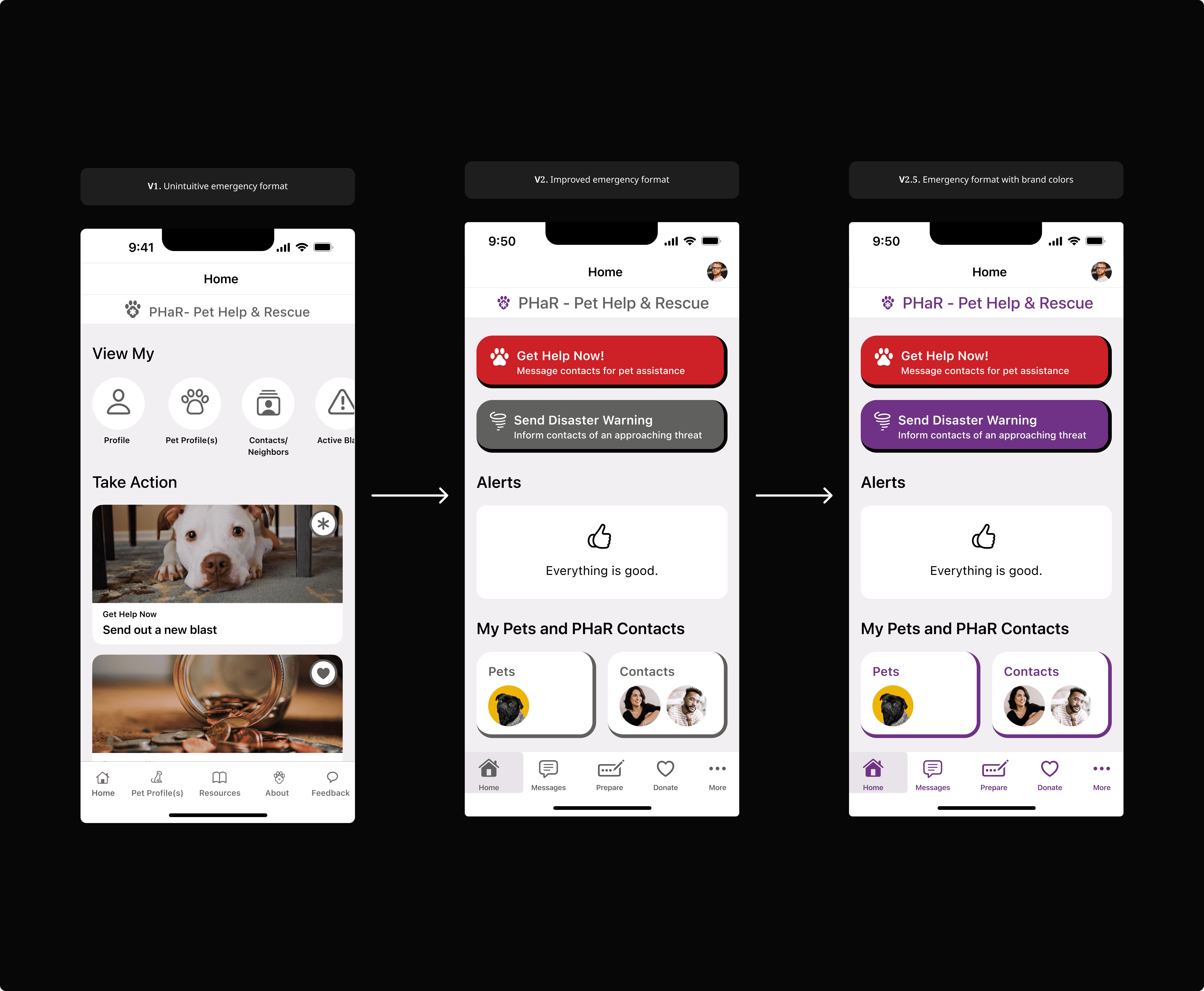
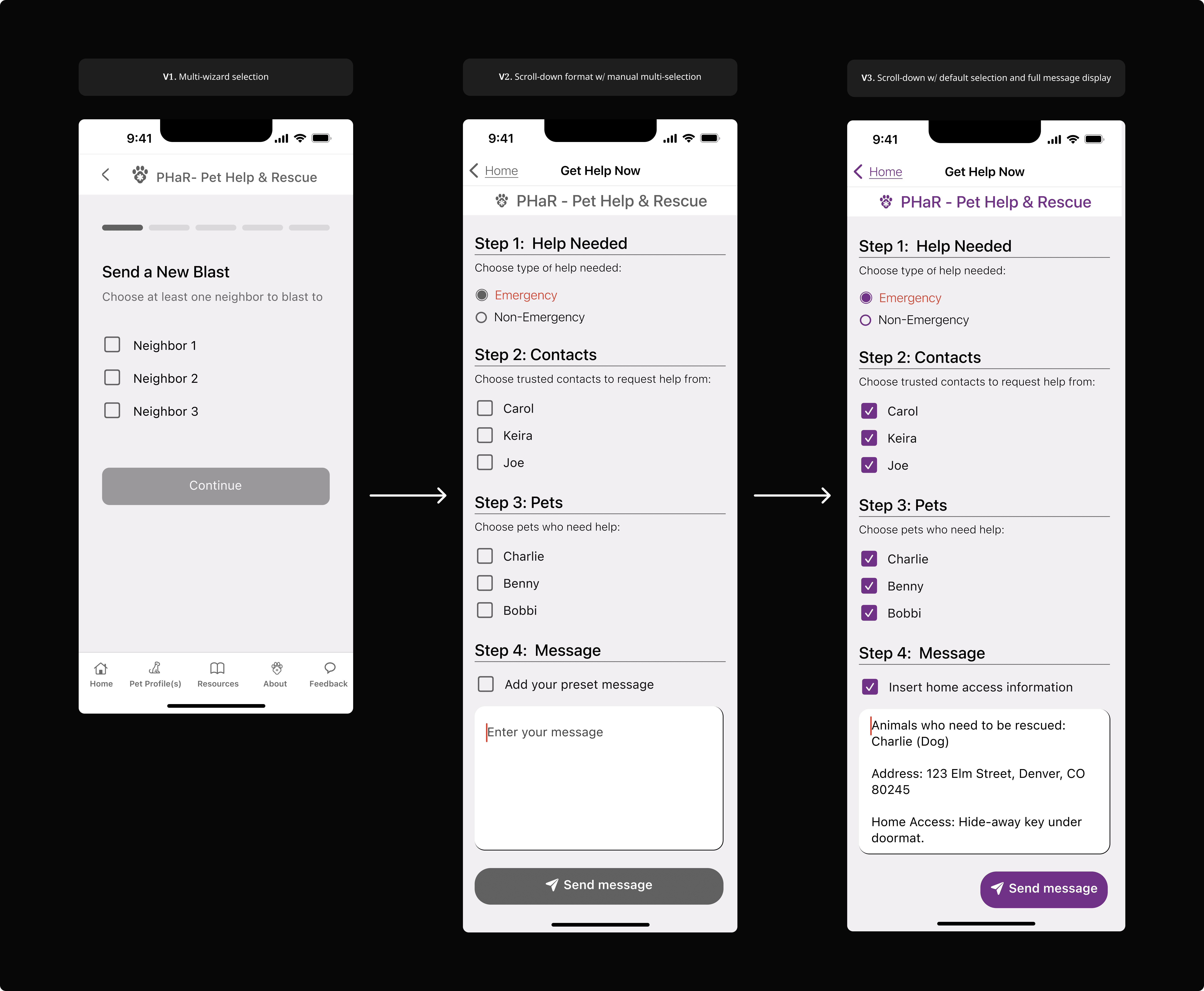
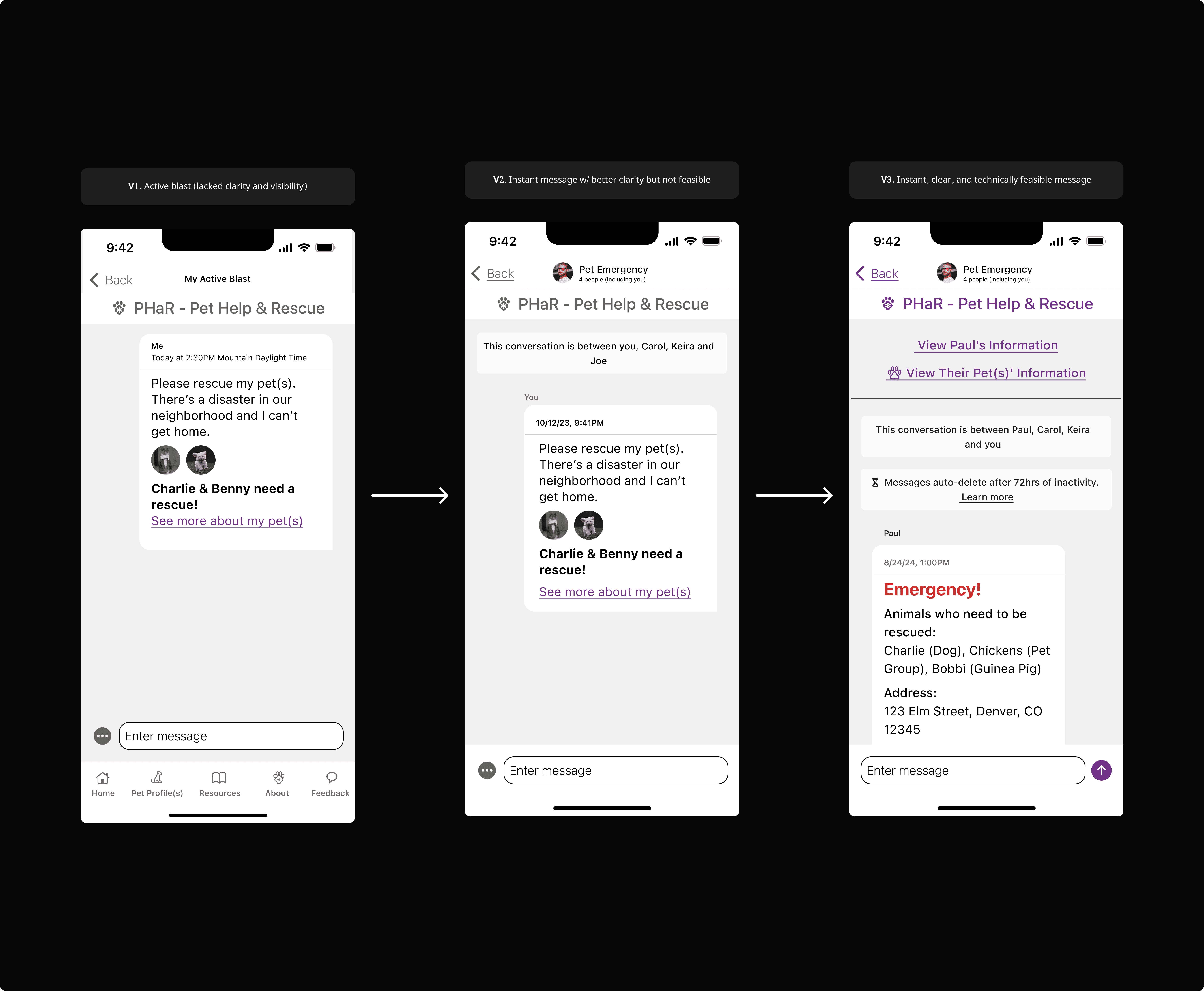
Each version was created with bottom-up processing, or consideration for the human perception system, as the focal point.
IMPACT
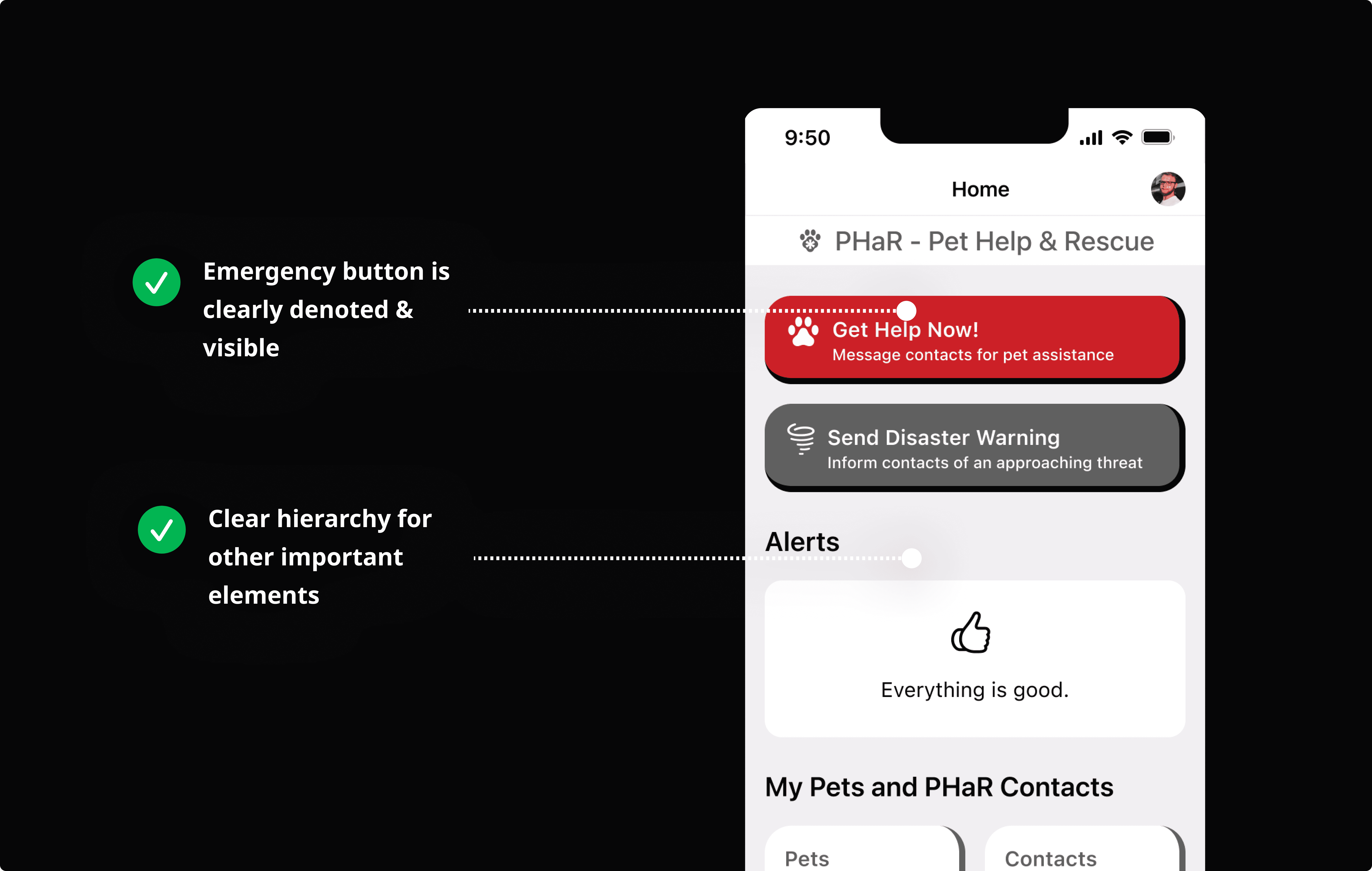
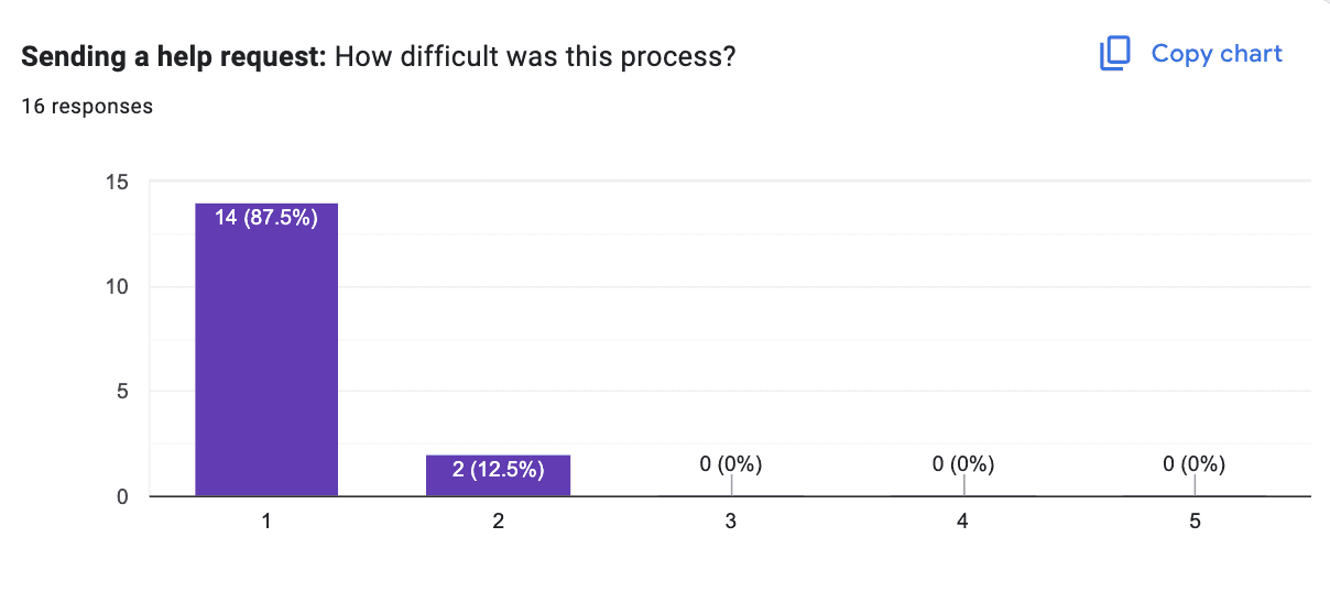
I Decreased Time-On-Task (ToT) by 92% & 100% of Testers Regarded the Flow as "Easy"
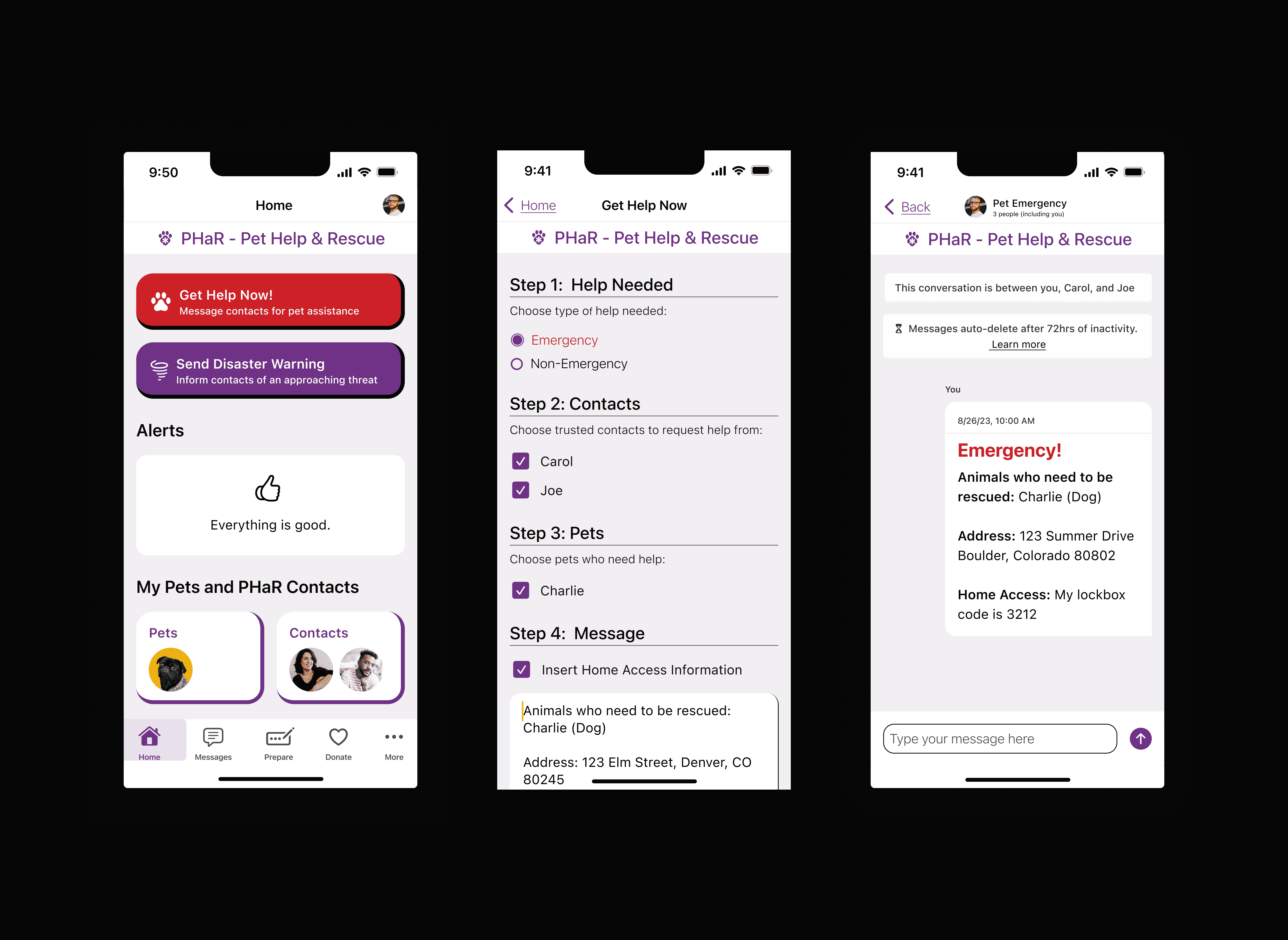
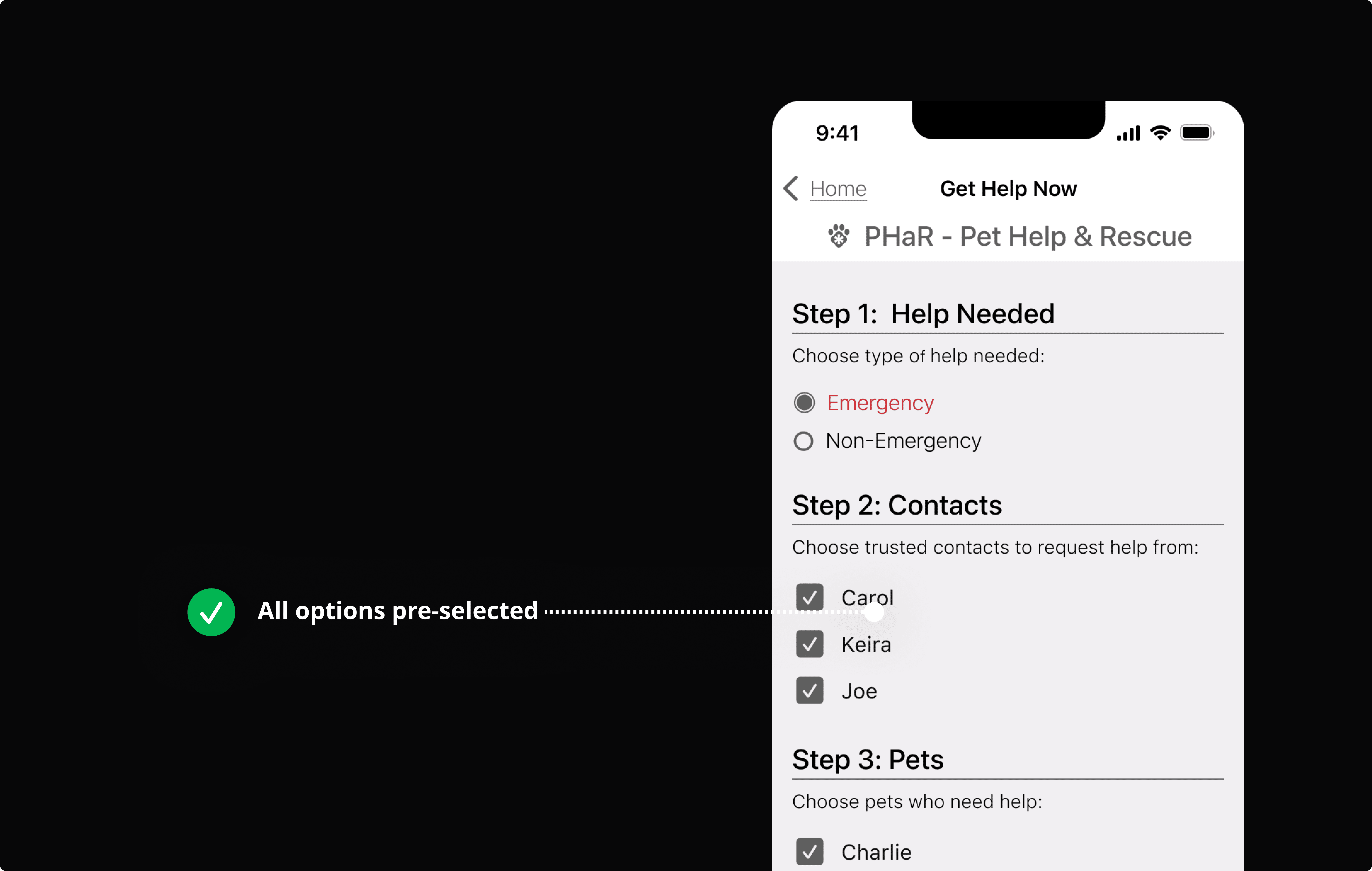
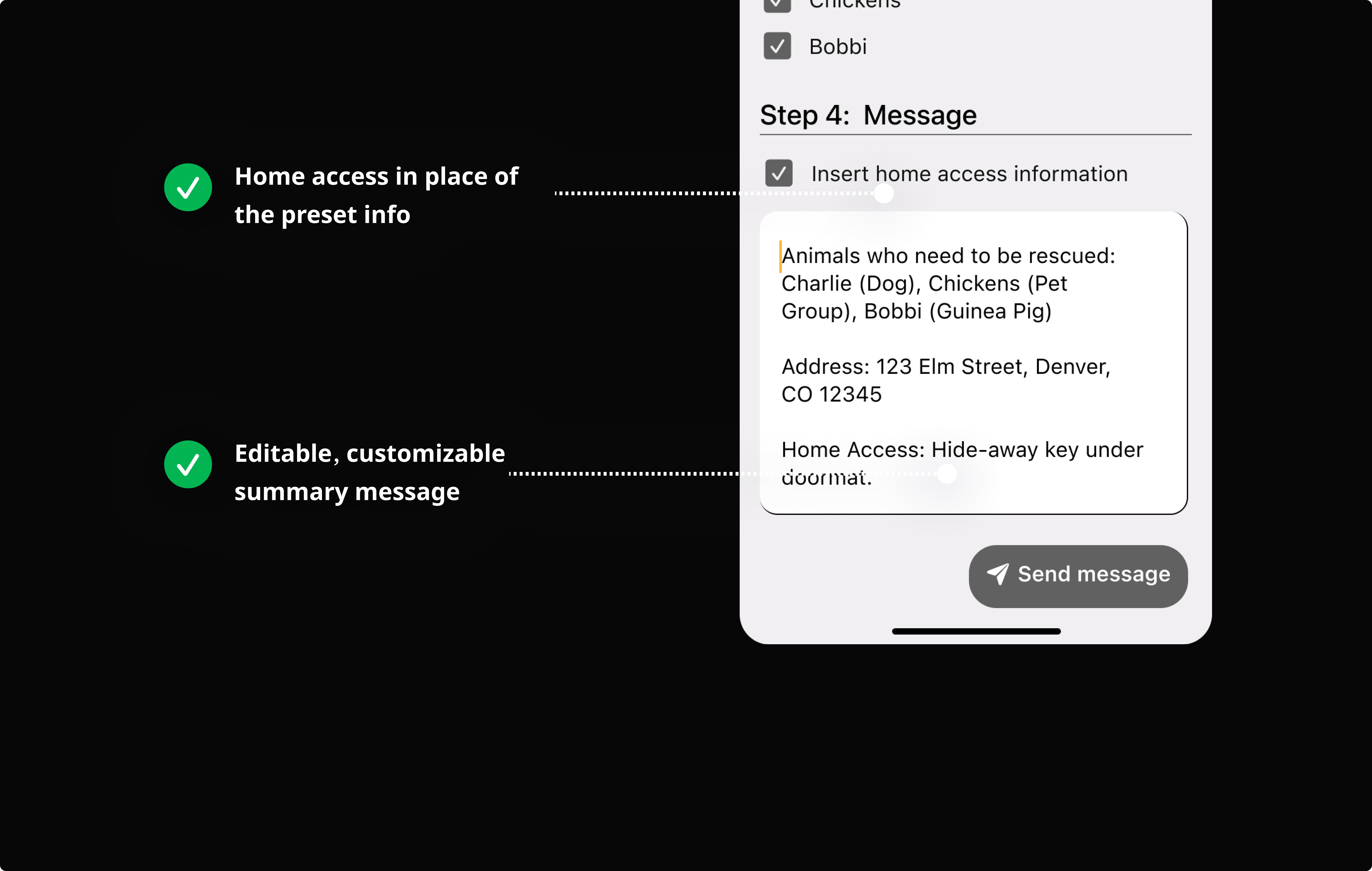
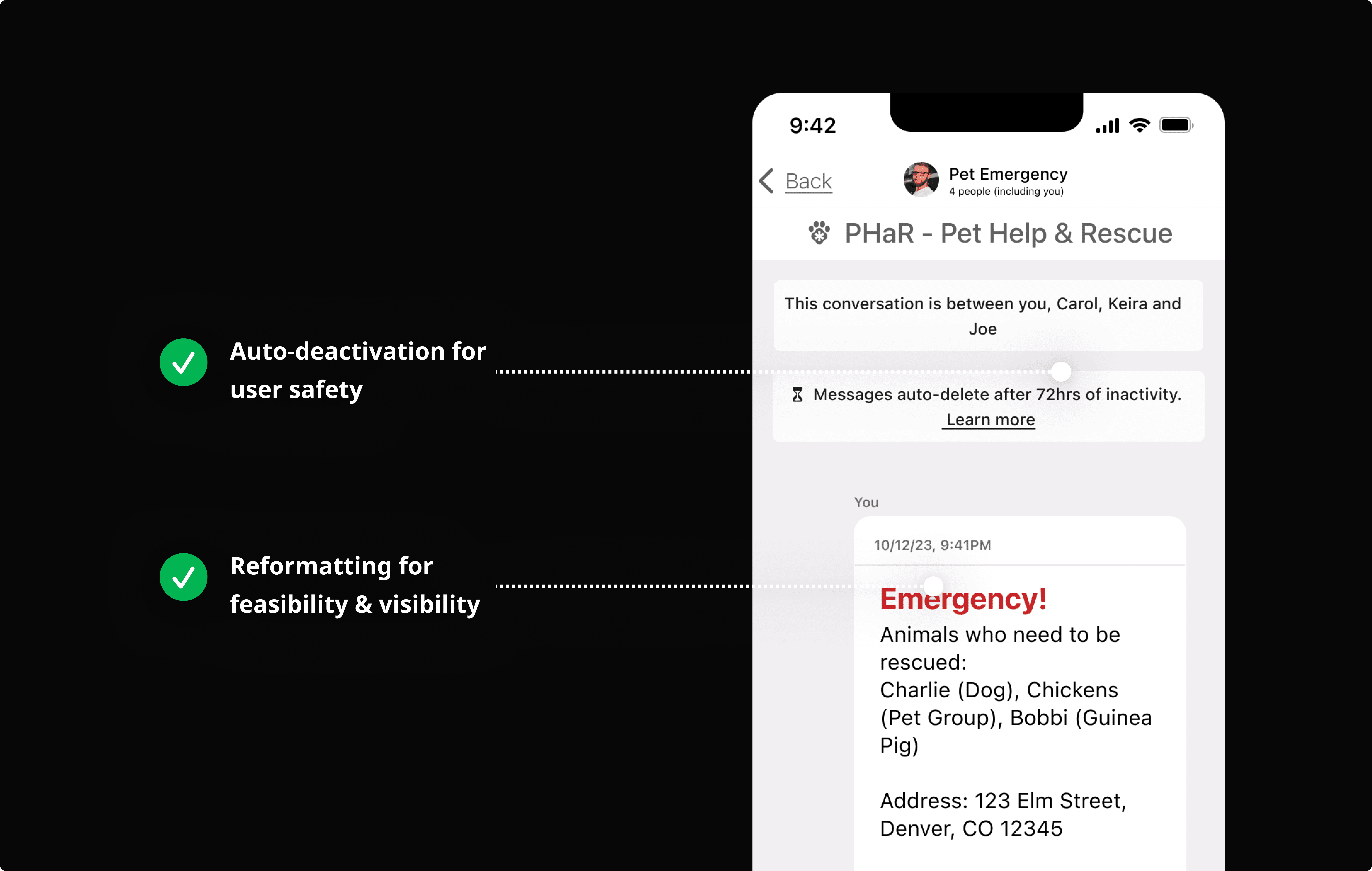
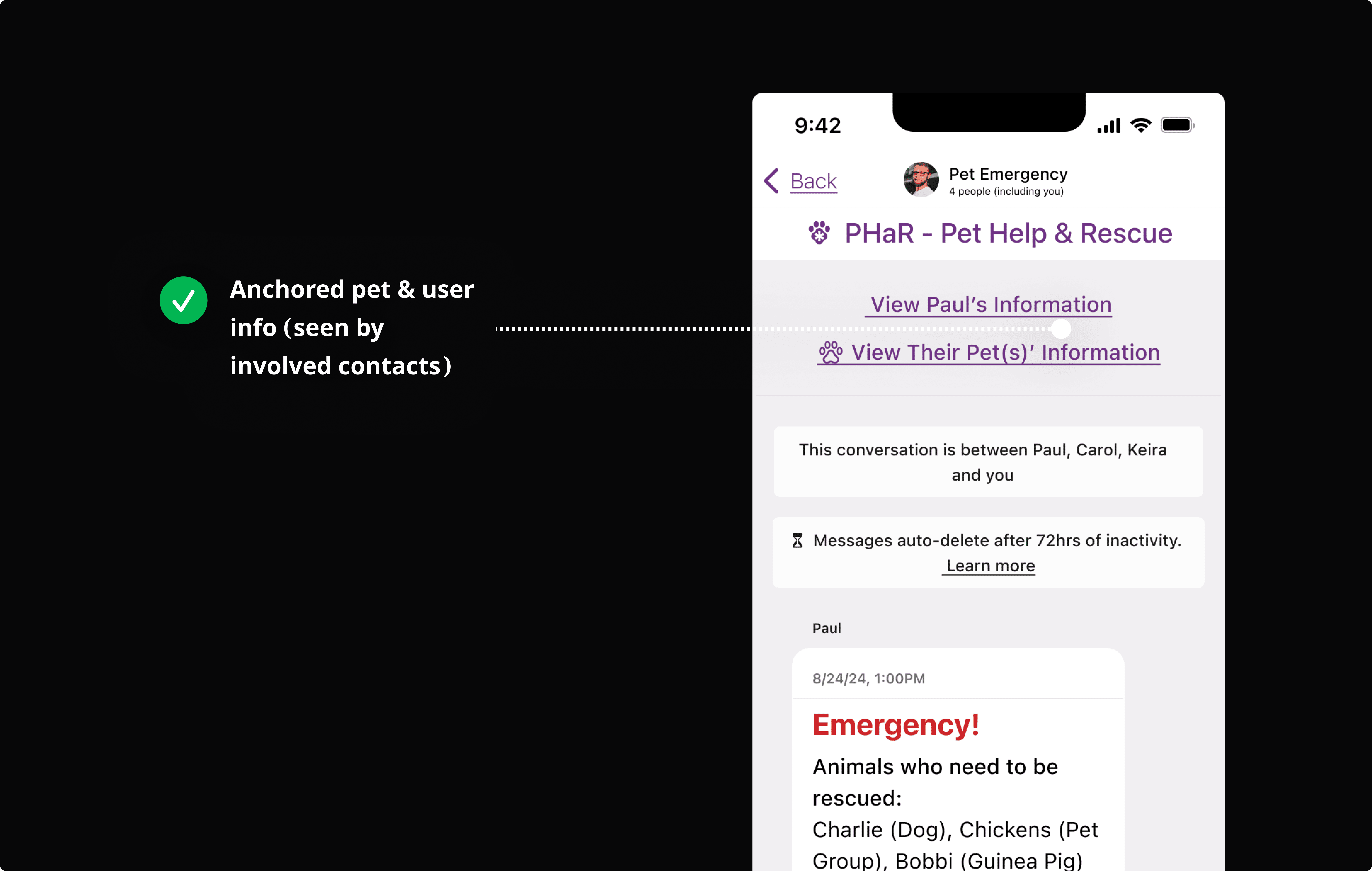
The app is a simple, all-in-one tool for pet parents. It helps them build an emergency help network and get the necessary resources to quickly evacuate or support their pet during a disaster.
Request Help in Seconds

REFLECTION
My Concluding Thoughts
I have made great sweeps in emergency messaging design. However, the app has a lot of room to grow, for instance, improving usability for users with little to no mobility. We have talks in the works regarding voice automation and being able to send out help requests without physical interactions.
