Pet Help & Rescue (PHaR)
A friends and neighbors approach to keeping pets safe and evacuating them when disasters strike.
Client
Animal Help Now
Services
UI & UX Design
Industry
Nonprofit & TECH4GOOD
Timeline & Status
9 weeks - Launched

My Role & Impact
Main UX Designer
I redesigned the MVP for Pet Help & Rescue (PHaR), leading the foundational user research, including market analyses, interviews, and early usability testing. I conducted a mobile heuristic audit, guided beta and QA testing efforts, and implemented a product board to streamline cross-functional collaboration. By holding informal workshops between design and development, I improved handoff efficiency by 42%. These efforts contributed to a 70% Net Promoter Score and improved alignment across teams.
Context
Pet Parents Are NOT Prepared For Disasters… A Fatal Mistake For Their Animals
The 2021 Colorado Marshall Fire took over 1,000 pet lives, exposing a critical problem: many U.S. pet parents lack emergency preparedness. Our mission was to build a "neighbors helping neighbors" solution to prevent such a tragedy from happening again.

UX Goals
Higher user adoption
Reflect pet parents' commitment to disaster preparedness and support.
Ease of use
Achieve low time-on-task rates to reduce pet parent stress when requesting help.
Maintain user engagement
Ensure users keep their information up-to-date, interact with important resources, and use the app when a crisis occurs.
Solution
An Application That Makes Emergency Preparation Easy and Quick
The app is a simple, all-in-one tool for pet parents. It helps them build an emergency help network and get the necessary resources to quickly evacuate or support their pet during a disaster.


Problem space
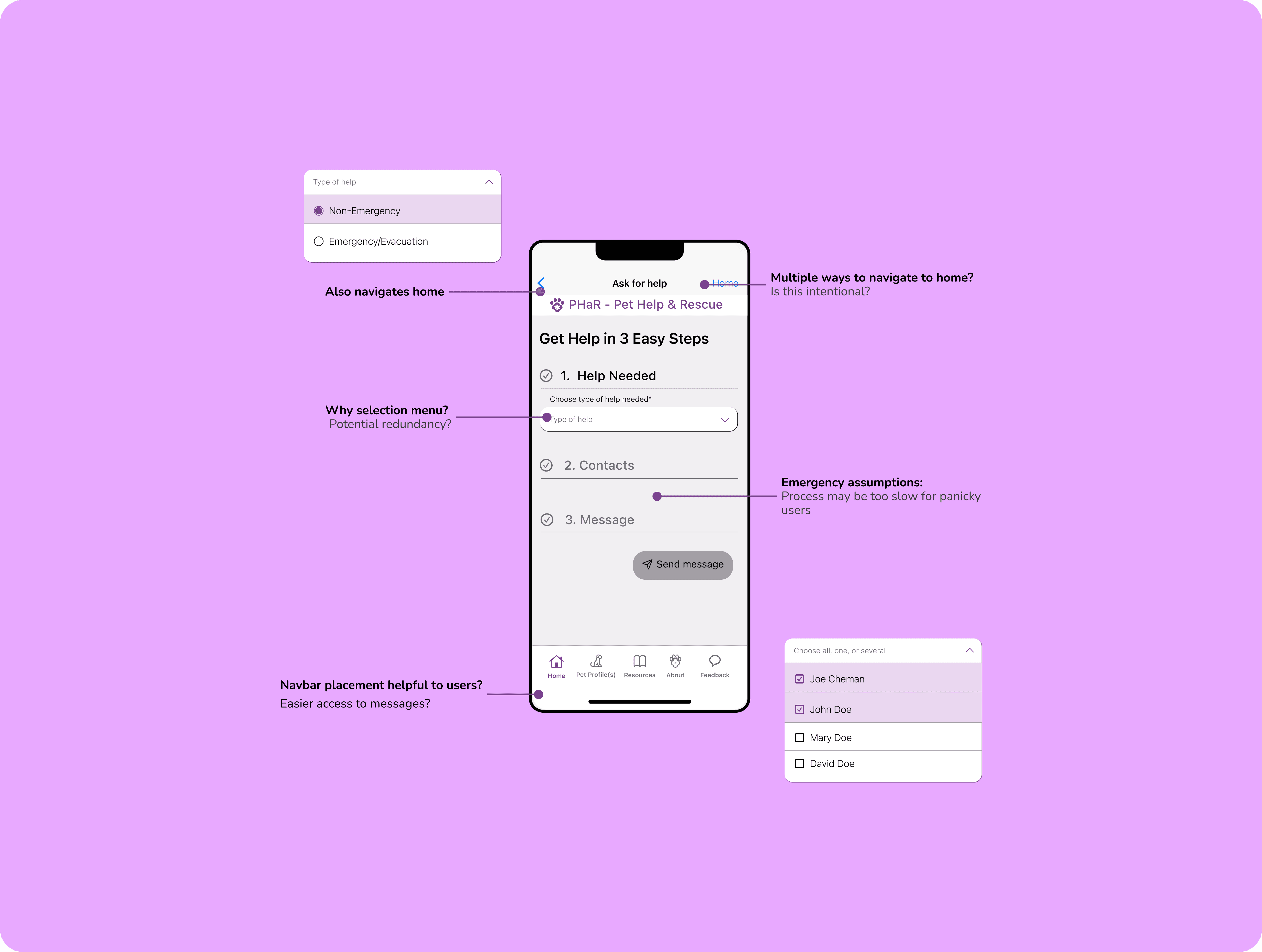
Poor UX in Critical User Flows = Reduced Emergency Effectiveness
I was brought iin during the ideation phase of PHaR. Through a heuristic audit and initial validation testing with a group of prospective users, several issues with the existing designs became evident, including...
1
Long task completion
Despite being an emergency app, it took several minutes to figure out how to complete basic tasks.
2
Poor navigation & layout
Critical actions were buried under several touchpoints, leading to confusion.
3
Paradox of choice
Stakeholder assumptions led to the addition of too many features, without considering user priorities, which caused cognitive overload.
Navigating a Tight Timeline
We had a strict launch period (as seen below), but my findings were too important to ignore. I knew they needed a stakeholder conversation, so I sprang into action with a quick presentation to get the team aligned.

Stakeholder Meeting
Presenting Design Issues to Stakeholders
I created a slide deck to call out specific issues in our user flows and get the team on the same page. (The deck has been modified to honor my NDA.) My goal: use this to realign our focus and create a clear path forward.


The verdict
Readjusting the Timeline
To stay on track, I worked with the stakeholders to alter our timeline to integrate these changes and make expectations clearer.

Discover: Foundational Research
Analysing the Competition and Market Landscape
With 66% of U.S. households now owning at least one pet and technology playing an increasingly significant role, the pet care app market has grown into a billion-dollar industry. Although PHaR operates as a nonprofit, I aimed to understand its unique value in a crowded market and validate stakeholder assumptions. To do so, I conducted a thorough analysis of the market landscape.


Key Takeaways
No other apps on Android or iOS specifically cater to disaster care.
Users share data more freely on pet apps, but privacy concerns are risng.
Users share data more freely on pet apps, but privacy concerns are risng.
Define: Feature Outine
Holding Workshops for Feature Prioritization

Develop: Design Principles
Establishing Design Principles to Guide the Process
Develop: Early Validation Testing
Rapid Wireframing and Prototyping: Create, Test, Iterate
Iteration 1: Step-by-Step Pet Help Request (Left-to-Right)

Relatively low cognitive load
Instructions are relatively clear
Too much manual selection
UX writing is not clear: "What is a blast?"
Improve on preset option for user clarity
Expects message visibility, immediately
Iteration 2: Full Page, Scroll Pet Rescue Request (Left-to-Right)

Pre-selected items, lower cognitive load
Instructions and language clear
Message display is more intuitive
Scrolling can be taxing (esp. with field expansions)
User information may not be necessary on sender's side
Deliver: Handoff-to-Development
Stepping in as Product Manager

Deliver: Beta Testing
Leading User Testing Efforts
While development began their work, I created a robust test plan using Notion and Google Sheets. I collaborated with several users across different device sizes and types and conducted multiple rounds of moderated and unmoderated usability testing. Although we didn’t have formal QA tools, I made the most of what we had and created a QA testing sheet for internal testers to use.


Solution: Testimonials
Hear From Some Of Our Users

Kiana Freeman
Recovery & Resilience Manager City of Louisville, CO
The Pet Help & Rescue application is such a benefit to our community. Keeping our pets safe is a priority. PHaR provides a service that allows neighbors to support each other like never before when disasters threaten and strike.

Leslie Irvine
Director, Animals and Society Certificate Program
With disasters increasing in frequency and severity, the PHaR app promises to save thousands of lives of our beloved animal companions.

Casara Andre
DVM Front Range Veterinary Medical Reserve Corps
As a veterinarian working in the disaster space, I am grateful to see this app come online. PHaR will save lives. And it arrives at a crucial time, as disaster preparedness, response, and recovery increasingly encompass pets and other animals. Neighbors helping neighbors can help keep all our pets safe.
